Big Effort, Small-ish Payoff
Here in Japan, the company I work for has been on winter break since Dec. 28. With a 9-day break, I was ready to tear into the project and then I got the flu immediately. Haven't been sick in years; the timing was terrible. Despite that, I soldiered onward and did make good progress.
I've been playing games start-to-finish and noting any bugs (shockingly few, and all are display-related). I'm very, very happy with the performance, stability, and compatibility of the system for z3, z4, z5, and z8 games. It feels very solid, overall.
The main theme for this week was, "Things I should do for completeness and correctness of the z-machine, which are annoying to develop and require a lot of effort and testing, but will only be used by a very few number of games."
Timed input support
The spectre of "timed input" has been looming over my head for years now, so I took the plunge. As far as I know, this is only used by one canonical Infocom game, Border Zone. But, in for a penny, in for a pound, as the saying goes so I might as well do my best to support the function.
The basic concept is that while the game is waiting for the player to type something, it will run some function at a regular interval which might cut short the user's input opportunity. We could imagine an event that occurs at 10:00 in game time, and while the user is thinking about what to type, the game continually checks to see if it is 10:00. If 10:00 occurs, then the user's input is interrupted and some in-game event takes place. If it is *not* 10:00, the user is allowed to continue entering a command.
I was able to work this into the interpreter over the past week and it seems to work as expected (with one annoying side-effect).
"Pre-loaded" input support
This is, apparently, something Beyond Zork relies upon. As I've mentioned in previous blog posts, the Pico-8 has some strict limitations on an application's codebase size. This is all in an effort to create constraints on the size and scope of a project, and to simulate the feeling of coding-of-yore, where clever solutions to overcome those limitations are necessary. As a general rule of thumb, devoting a lot of "tokens" to solve any given problem should hopefully be able to provide benefits beyond the immediate problem being solved. In other words, we want to get as much value out of our token usage as possible.
This was not one of those cases.
When the z-machine is ready to read user input, one of the latter features of the system is that the memory area into which user text will be stored *might already be populated with previous text.* I knew this to be the case, and store the textual bytes appropriately. What I did *not* understand was that the game may or may not decide to display some of that cached text at the prompt. A so-called "pre-loaded" prompt, it is as though the user previously typed some characters into the prompt, and now they're being shown at a later time.
This is now working, but what a pain in the butt to handle. We have to look at the text the game output, check the buffer, check to see if the on-screen text matches the previous buffer, divide that text into screen-only and preloaded-input, and allocate strings appropriately. It took a fair number of tokens just to handle this ultra-rare edge case, thanks to a poorly designed z-machine specification.
Annoying! (but it works now)
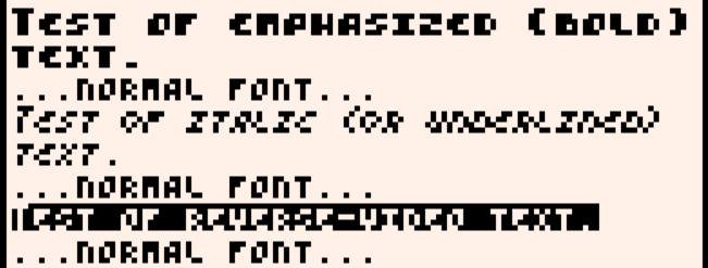
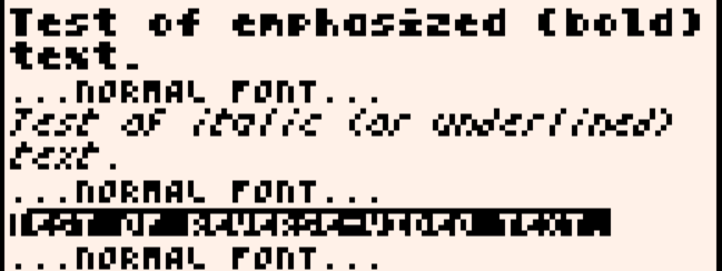
New bold and italic fonts
The bold and italic fonts have always bothered me. I think they were fine first (third?) attempts, but there were two things that drove me crazy. The italic font, in trying to match the small-cap style of the native font, was simply difficult to read. The bold font, again based solely on the built-in font, looked too high-tech to my eye.
To increase legibility and to create a "softer" design, I have redrawn both fonts from scratch, while studying the early work of Susan Kare's screen fonts on the original Macintosh. Her understanding of how to place pixels, and when *not* to place a pixel, was second-to-none. I opted *against* matching the small-cap style of the Pico-8 built-in font.


I think the new italics stand out better as emphasis, while also being easier to read. The bold font... I still feel undecided on. The old font has a uniformity and balance the new font lacks a little. I do like having standard upper/lowercase letterforms, however. Maybe I can make it a user-settable option: lowercase vs. small-caps
Rewriting the display system: a side-journey
If I don't at least attempt to do this, it will nag at me incessently. While working on the timed input, one of the tests for that reveals a frustrating gap in the abilities of the display system. It's pretty good at showing text at arbitrary positions in the upper part of the window (the so-called "window 1"). That is where the status bar lives, and the Seastalker "sonarscope".
However, the system is *not* built for text display at arbitrary screen positions in the bottom window, the "window 0" of the machine. I basically ignored requests like that, because the screen is so narrow I need to buffer and do word-wrap constantly. I simply don't trust that outputing text to screen based solely off the cursor position will work without my direct programming intervention.
This is, in part, just me fighting against Pico-8 and is also, in part, me fighting against my past-self.
I need to try rewriting the display system to be much more z-machine friendly. Nothing may come of it, and if it works its benefits are likely to be vanishingly miniscule, visible only in highly selective edge cases. However, it would also help put my mind at ease that I don't have to rely on "tricks" any more to get things working. The system needs to "just work" due to being a correct, proper implementation of the z-machine spec. Getting this demon off my back would feel great.
Get Status Line
Status Line
Play Zork (and more!) on your Pico-8
| Status | Released |
| Author | Christopher Drum |
| Genre | Interactive Fiction |
| Tags | infocom, inform, PICO-8, punyinform, Text based, z3, z5, z8, z-machine |
More posts
- v3.0.1 hotfix postedFeb 15, 2025
- v3.0 Released! z5 and z8 support, full color display, timed input, games up to...Feb 14, 2025
- v3.0 beta reachedFeb 09, 2025
- 7-10 split? Fore!Feb 03, 2025
- Infocom Purists - DO NOT READ THIS!Jan 27, 2025
- v3.0 alpha test progress reportJan 19, 2025
- v3.0 alpha reachedJan 13, 2025
- ask pig about pig -> 162,000 opsDec 29, 2024
- Battening Down HatchesDec 23, 2024

Comments
Log in with itch.io to leave a comment.
the new fonts are definitely better!
Thank you, I appreciate the feedback! It's tough to get legibility in 4x5 pixels.